Ontario Park Kiosk
A touchscreen concept designed to help visitors move through park information, maps, and featured content in a guided, approachable way.

Overview
This project is being developed as an interactive public-facing experience. The focus is on clear navigation, quick decision-making, and a strong visual hierarchy for kiosk use.
Timeline
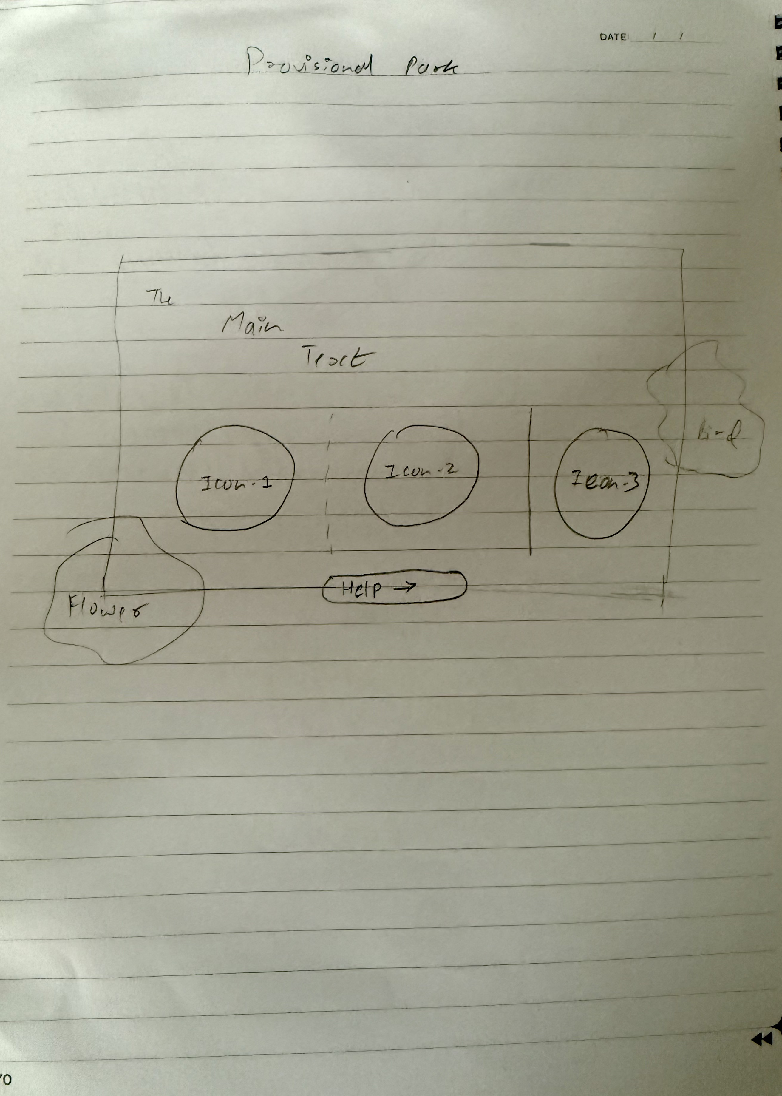
The kiosk started with paper planning to map the main user path before moving into screen design. This stage helped define the order of key content, the primary touch points, and how visitors would move from general park information into more specific actions.

Structure
The layout is being planned around fast category scanning so users can jump between maps, notices, and highlight content without getting stuck in a deep menu system.

Direction
The visual direction is intended to feel clean, readable, and public-space friendly, with large touch targets and strong contrast across key actions.
Additional Screens
